
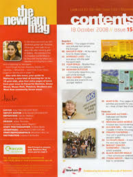
In my original contents page this is what i have attempt to imitate, with not a lot of significant difference apart from the colour scheme and this introduction down the left hand side of the page at the bottom of the page instead of the white i used a black bottom and i fill it compliment the red and white better, the main reason for why i like this page is the colours and darker contrast from the picture combining with the lighter font colour and size in which my opinion is eye catching, it also fits in well with my front cover and doesn't go of colour theme and page layout. It also has a clear layout of what is expected in the magazine, it is clear and easy to read. With a clear demonstration that it is the contents page and not an ordinary page. Finally in my opinion i believe that the main image also represent the same age genre my magazine is attempting to reach and maybe the audience can relate to this image with my magazine ' Indecisive'
No comments:
Post a Comment