Wednesday, 18 April 2012
Tuesday, 17 April 2012


Wednesday, 28 March 2012
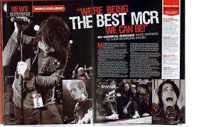
This is a music magazine double page which i like. the reasons for why i like it is the depth in the image as it during a performance which looks good! the white colour down the right hand side compliments the black and red but it also compliment the main image which has a shadow tone over it!. The writing itself is clear and bold clearer to the reader! the colours clearly suit the type of magazine! which is rock and roll and bold! the individual side photos placed along the bottom also compliment the whole magazine as they are the same shadow cover and contrast levels this makes the magazine look complete! altogether i like the main image and the font, however i don't like the small font and little amount of writing!
Tuesday, 27 March 2012

the red would be where the main image would be of the band paradoxity, this would have a high saturation but low contrast as my ideal background to fit in with out segment would be black
the green would be the interview with paraodxity the writing itself on the black background wild be would and the questions would be in a vibrant red.
the yellow would be the tour dates of paradoxity being in White writing
and the blue would be advertisement and other factors
contents page research

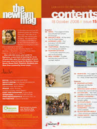
I likes this contents page because of the layout of it, it has 6 clear main images which stand out individually from the texts itself...
The texts however it very boring and simplistic! there may also be an excess amount in the top left hand column of the page! although this may be an introduction to the magazine i fill it may be to much and bore the reader as this magazine in particular being KERRANG! may not fit in with the target audience who care more about the music rather than the detail in the magazine itself! The right hand coilumn demosrating the whats the magazine is going to contain it is clear bold and stands out from the smaller fonts! the colour scheme is clear with the black box surrounding the yellow font which is clear and easy to read! In my opinion the music magazine contains a lot of depth and levels especially presented in the photos which all tell a different story!
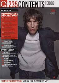 In my opinion this music magazine contents page from Q is both good and bad. the colour scheme for a start is very good easy to see and very complimentary of each other making the magazine clear and predictable, which instantly allows the audience to predict what they are going to get. i also like the picture itself although its not beautiful its clear and has a lot of depth and intertest! what i dislike about the contents page is the lack of writing and context. which could also be seen as a bonus or positive thing, it leave the page to open itself. The shadow around the main image is very clear and gives the image almost and extra layer but also makes the image stand out from the rest.
 This contents page is also presented by a media student however i really do not like this image as it has not layer or context or depth itself. the information is boring and unappealing to the eye, the main image is unappealing and for a start it is not clear. and the lay over the top can not been clearly seen! the information available on the page is boring and dulh it would not attract or interest any of the audience!
magazine contents research
In my opinion i strongly dislike this contents page, firstly i believe that there is to much writing for a contents page which means it is more likely to go of the point of the magazine and maybe explain in a bit to much depth what is going to be in the magazine. Also the colour scheme and layout dont compliment each other, they should stick to a solid colour scheme and not alter it around to much, especially yhr yellow and orange placed down the left hand side of the page, takes the focus away froim the centre image.
The images also do not interest me at all, they occur very plain and boring! they also dont represent the theme of a music magazine it looks more like a housing magazine rather than a music magazine, although they may be trying to represent a bright and interesting vibe of the magazine it just doesnt occur.
contents research continued

In my original contents page this is what i have attempt to imitate, with not a lot of significant difference apart from the colour scheme and this introduction down the left hand side of the page at the bottom of the page instead of the white i used a black bottom and i fill it compliment the red and white better, the main reason for why i like this page is the colours and darker contrast from the picture combining with the lighter font colour and size in which my opinion is eye catching, it also fits in well with my front cover and doesn't go of colour theme and page layout. It also has a clear layout of what is expected in the magazine, it is clear and easy to read. With a clear demonstration that it is the contents page and not an ordinary page. Finally in my opinion i believe that the main image also represent the same age genre my magazine is attempting to reach and maybe the audience can relate to this image with my magazine ' Indecisive'
Monday, 30 January 2012
different camera poses and the different effects they produce.


ethnciity in media
In class we have been looking at how ethnicity is represented in todays society, so we watched an extract of a episode of spooks, we had to analysis all the techniques used which can either decode or connode meanings and preceptions of ethnicity.
In the extract of Spooks, there has been many thought out ideas to represent ethnicity, in either a positive or negative ways. Sometimes they do this by stereotyping and prejudice and also by making the audience want to conform with these ideology placed and imbedded in todays society. Nevertheless they allow the audience to denote and connote these ideas, in which ever way they wish too, they provide the guild lines to either a positive or negative representation of ethnicity.
Camera angles are used thoroughly in the extract to show; superiority, dominance, weakness or mass effect. One of the main characters that opposes todays stereotypes and ideologies of ethnicity is Marvin who is Islamic and was raise in Pakistan, he is shown in a number of camera shots in the first minutes of the extract. I believe one of the most important shots used to show this is the over the shoulder shot, which is angled over the shoulder of Marvin looking at two Caucasians a man and women, this shows the rivalry between the two ethnicities, but also shows the dominance of the Caucasians as they are paired up where Marvin is alone, stating that they have more dominance by the amount of people compared to that of lone Marvin. Anther strategized and thought out camera shot is that of the low angle shot used to shows the Islamic (1 uncover MI5) believers praying, this use of low angle shot suggests that they are attuned with their religion/faith, however us can also show superiority over other races, due to these men being suicide bombers, they may fill an indigenous power due to the little knowledge that the outside have of the plain. We also acknowledge quickly from a 2 shot of two high powered Caucasian MI5 personal that they consider themselves high powered and superior to other races, we also soon can confirm this with the quickly followed, low angle shot of the pair, which make them look large, with significant dominance.
Another important factors that can relate to the audiences perception of ethnicity is editing, which is used to show; scenery to optimum effect, dominance/importance and contrasting of objects. There is a clear use of editing used in the extract. Focus pulling is used in the extract, where the two Islamic suicide bombers with the undercover MI5 agent, are reminiscing over a song (50 cent) in relation to their family and recalling previous events, the focus is on the one Islam explaining about his previous relations with the song, this the audience can connote as a positive representation of ethnicity, as they are challenging the stereotype that all suicide bombers have ‘no heart or will or haven’t live a so called normal life’, it also shows that these terrorist have emotions and maybe forced into a situation. A flashback is used early on in the extract which show us the hideout of the terrorist group talking about the bombing, however it also shows us that event has been pre-planned and also prejudice a new setting which conforms to stereotypes of Islamic ethnicity, with the fact that the setting is dark dim and hidden away from society, with a low level of detail and sophistication, this may relate to the eastern cultures where the faith Islam is renowned. Juxtaposition is used at the beginning of the clip with the two Caucasians and the suicide bombers, its shows a contrast of race which contradict each other, however it shows that a difference in many factors that conform to stereotyping of both races, it conforms to the Caucasians being, snobby with a feeling of power and dominance over other races, almost like an invisible feeling with optimum superiority. Nevertheless it also follows to stereotypes in relation to Islam who they fill have a shallow and pedantic lifestyle, with little or no income, scrounging of whatever society can offer them. Finally a good editing technique used in the extract is the tacking of nadif as he leaves his home, and is followed by a CTV camera, this show use that due to a lead nadif is the main suspect however are they following him due to his race or religion.
A final factor that effects and alter the publics view on ethnicity is mis-en-scene, which is just what’s going on in the scene, firstly we can connote that the Caucasian mean are seen as superior to the Islamic believers, we know this from the scene where the high powered MI5 agents are in a posh barbers, they are dressed formally, speak well and in a formal location, compared to that of the Muslims who have little conscious of the clothes they are wearing, speak informally and are located in a cheap flat with little options available to them, this can be associated with todays society, however it would be conforming to stereotypes that white men are superior to other races, and that Muslims have little opportunities and live a economically disadvantages life, with little luxuries. However the scene where the Muslims are praying towards mecca in their traditional clothing, it demonstrates how the Muslims faith is strong and willingness, which can challenge stereotypes that all Muslims are evil and shallow with a low standard of living.
My conclusion is that Spooks both challenges and conforms to todays present stereotypes and specific prejudices about ethnicity, nevertheless it lets society destruct their own view of society and neither fully challenges or conforms, overall it is neutral, just lay the foundations for people to construct and determine their own views.
representation of sexuality
How do the producers of this episode of The Street represent sexuality?
The street is a T.V drama which focuses on social realism, its based in the north of England in such places as Newcastle and Manchester, its based on lower working classed people living in a urbanised society, that often depend on benefits. The dominant ideologies presented in the street are mixed. The positive ideologies being that gay/homosexual is more accepted in society and can occur in even the so called ‘masculine’ areas the example in the street being a demolition site, it also challenges today stereotypes of homosexuality, finally it uses affairs in the episode to show that marriages and family life breaks down after an affairs regardless if homosexual or straight However it also presents negative ideologies through the lexical field used off homosexuality such as; queer, gay, bent. Another reason is the way the male demolition worker refuses to accept that he is gay, this shows that there are people in society that are scared to out in the open about their sexuality.
These set of ideologies both negative and positive are reinforced in the TV drama by the use of stereotypes, expectation and prejudice that can be involved in every day society in current times. Its an accurate representation of what life can be like for certain people, it also relates closely to focus which is social realism so the producers probably aim to keep the drama as close to reality as possible.
The street and in particular challenge certain aspects of ‘normal’ life, they challenge the fact that gay people may not be necessarily accepted in society but have made progress this is due to prejudice and pre judgement this can be summed up by Vito Russo who stated that from the 1890’s-1930’s gay/homosexual people were presented through the media as an object of humour and ridicule but Russo later states that there was a self-censorship code introduced to not allow overly gay people to perform in theatres . It also challenges the stereotype that all mean are portrayed in a feminine way, its challenges this by placing both of the gay characters on a demolition site. It wasn’t till the 1990’s that homosexuality has become popular in media.
As the audience I would decode a negative attitude towards homosexuality this is due ton the negative vocabulary used in the episode and the way they are judged on up north in a negative way sometimes being associated with as ‘queer’ it also demonstrates violence towards gay men which could be seen as another type of prejudice this is seen in the scene where Charlie gets attacked in the gay bar, this could be due to someone thinking he was weak or gay. The whole thing just has a negative attitude towards homosexuality and in particular gays. Due to the prejudice shown through the episode I believe that homosexuals are treated as an inequality almost like they have committed a crime and conspired against, this would support Joshua Gamsons theory. On the contrary I believe the producers were trying to create a positive attitude about gays due to the fact that Tom and Charlie work on a construction site which is not very stereotypical and challenges this thought.
I believe the media has a responsibility to try and create a positive attitude towards different groups in the public, to try and get rid of certain stereotypes, this is due to the basis that a lot of stereotypes are become more acceptable in society now and if they are discriminated against this may loose the company a lot of money and viewers, so I believe that they will have to present groups accurately.
Tuesday, 24 January 2012


Wednesday, 18 January 2012

View more presentations from jackmorris05.
Wednesday, 4 January 2012

this is one of the pagfe layout designs i have planned for using on my magaizne, hpowever it is only a plan and not my finished edition, it has a simple layout with very little detail or design, howver it is similar to the magazine cover i am trying to copy, however it still nbeeds some adition work done to it.
Tuesday, 3 January 2012

contents page research

This is a contents page from a fashion designers magazine, i like this image as it has a unique main image, that catches the readers attentions as being 'sexy' and 'indearing'. with all the writing down the iright hand side of the page, it has a clear and precise tone, with the use of serif font it can be decoded as formal with a higher importance than that of a magazine such as 'heat'.
Subscribe to:
Posts (Atom)