Wednesday, 28 March 2012


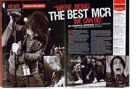
This is a music magazine double page which i like. the reasons for why i like it is the depth in the image as it during a performance which looks good! the white colour down the right hand side compliments the black and red but it also compliment the main image which has a shadow tone over it!. The writing itself is clear and bold clearer to the reader! the colours clearly suit the type of magazine! which is rock and roll and bold! the individual side photos placed along the bottom also compliment the whole magazine as they are the same shadow cover and contrast levels this makes the magazine look complete! altogether i like the main image and the font, however i don't like the small font and little amount of writing!

Tuesday, 27 March 2012

This is a magazine front cover produced by vibe, in my opinion it is a good magazine, due to the black background and complimentary colours supporting the picture being white and yellow, the information is clear and you can instantly tell that it is a music magazine. the image has depth and understanding, the main reason why i like this front cover is the colours which in my opinion are clear and easy to understand, there is not to much or nor to little it is a good amount that the audience may want to read before they purchase the magazine, to much would bore them to little would not interest them enough.
This is my plan for my double page spread.
the red would be where the main image would be of the band paradoxity, this would have a high saturation but low contrast as my ideal background to fit in with out segment would be black
the green would be the interview with paraodxity the writing itself on the black background wild be would and the questions would be in a vibrant red.
the yellow would be the tour dates of paradoxity being in White writing
and the blue would be advertisement and other factors

contents page research


I likes this contents page because of the layout of it, it has 6 clear main images which stand out individually from the texts itself...
The texts however it very boring and simplistic! there may also be an excess amount in the top left hand column of the page! although this may be an introduction to the magazine i fill it may be to much and bore the reader as this magazine in  particular being KERRANG! may not fit in with the target audience who care more about the music rather than the detail in the magazine itself! The right hand coilumn demosrating the whats the magazine is going to contain it is clear bold and stands out from the smaller fonts! the colour scheme is clear with the black box surrounding the yellow font which is clear and easy to read! In my opinion the music magazine contains a lot of depth and levels especially presented in the photos which all tell a different story!
In my opinion this music magazine contents page from Q is both good and bad. the colour scheme for a start is very good easy to see and very complimentary of each other making the magazine clear and predictable, which instantly allows the audience to predict what they are going to get. i also like the picture itself although its not beautiful its clear and has a lot of depth and intertest! what i dislike about the contents page is the lack of writing and context. which could also be seen as a bonus or positive thing, it leave the page to open itself. The shadow around the main image is very clear and gives the image almost and extra layer but also makes the image stand out from the rest.


This contents page is also presented by a media student however i really do not like this image as it has not layer or context or depth itself. the information is boring and unappealing to the eye, the main image is unappealing and for a start it is not clear. and the lay over the top can not been clearly seen! the information available on the page is boring and dulh it would not attract or interest any of the audience!

magazine contents research


In my opinion i strongly dislike this contents page, firstly i believe that there is to much writing for a contents page which means it is more likely to go of the point of the magazine and maybe explain in a bit to much depth what is going to be in the magazine. Also the colour scheme and layout dont compliment each other, they should stick to a solid colour scheme and not alter it around to much, especially yhr yellow and orange placed down the left hand side of the page, takes the focus away froim the centre image.
The images also do not interest me at all, they occur very plain and boring! they also dont represent the theme of a music magazine it looks more like a housing magazine rather than a music magazine, although they may be trying to represent a bright and interesting vibe of the magazine it just doesnt occur.

contents research continued


In my original contents page this is what i have attempt to imitate, with not a lot of significant difference apart from the colour scheme and this introduction down the left hand side of the page at the bottom of the page instead of the white i used a black bottom and i fill it compliment the red and white better, the main reason for why i like this page is the colours and darker contrast from the picture combining with the lighter font colour and size in which my opinion is eye catching, it also fits in well with my front cover and doesn't go of colour theme and page layout. It also has a clear layout of what is expected in the magazine, it is clear and easy to read. With a clear demonstration that it is the contents page and not an ordinary page. Finally in my opinion i believe that the main image also represent the same age genre my magazine is attempting to reach and maybe the audience can relate to this image with my magazine ' Indecisive'